Have you ever designed a web page; or a visualforce or lightning page? If yes, then many times you might have been in a dilemma while writing the code for it, which color to put, what should be the font, how to align items properly.
Today, I am going to show you some of the tips and tricks that will help in better designing a web page.
- Learn Bootstrap. Bootstrap is now a very widely used framework to get responsive UI. What does responsive mean? Responsive UI means a web page / UI design that adapts automatically to different devices. So, let’s take an example, we have a very wide section that renders properly in desktop, but when the same thing is viewed in mobile, we are not so much convinced. Why does this happen? This is because the mobile devices have lesser screen width than the desktop screen. So when the browser tries to render the same full-width section in the mobile, the representation is not so good and fails most of the time. This is where Bootstrap comes into the picture. If you use this framework and include some of the bootstraps CSS classes, it will take care of the responsive design automatically. One of the best features of bootstrap is the grid-system. This will help in ordering the sections perfectly both in wide and mobile devices. See this link to know more about grid system in Bootstrap.
- Avoid using tables. Try to avoid the use of tables as much as possible. Using tables are very tempting and easy to get a perfect tabular representation on the page, but in turn using them will cost you load time. A browser takes a lot of time to render a table, and if there are nested tables or multiple tables then the load time will deteriorate further. Instead of tables, use float div’s, flexbox to achieve the functionality. You can even take help of the bootstrap grid system to get tabular representation.
- Use flex wherever possible. Now this will contradict my previous point, where I told to maximise the use of float divs. Float div’s are good to have when we need side by side representation. But float div has a disadvantage also. It will disconnect the floating div’s from the parent DOM, which will sometimes not render well on the page or will create conflicts with the nearby elements. To avoid that, we have to clear the float and reattach the floating divs with its parent. Instead, there is a new technology coming around called flexbox, which can help achieve the same functionality without using float. Check this link to tinker around with flexbox. This will not only help in horizontal alignment of elements in the page but also can do the vertical alignment of elements across the page.
- Use of softer colors. The use of colors on the web page has always been a hard decision for most of us. Which colors to use, how many colors to use; so on and so forth? A hard fast rule of a good looking web page is not having more than 2/3 different shades of colors (except images). Try avoiding too many colors in the page. Stick to 2 or utmost 3 different shades, that will maintain the linearity of the page. Also, try using softer shades. For example, if you want to have black text color, avoid #000 which is dark black or pitch black; instead, use #333 or #666 that will give a softer and smoother look to the text. Eg: Here is a pitch black text with #000 | Here is a dark grey text with #333 | Here is a smooth black text with #666. Please refer to good websites and see what are the color samples they are using. I refer to www.quizup.com for color samples. Here is another example of red. This is a dark red color. | This is soft red. As you can see the later is much more appealing to the eye. These small color changes can make your simple web page look much more professional. Below are the color samples:
For reds

For yellows

- Correct use of Fonts. Use of correct fonts plays an important role in designing a good web page. By default, the font of a web page is Arial/Verdana which might not appeal to many users. So, many times developers use their fancy looking font available in their systems; but they forget that the same font is not available in the other viewers’ system. During such times, the browsers render the web page with default fonts which can be a total disaster to the page. Instead always try to use web safe fonts. The advantages of web safe fonts are –
- they are widely available in different devices
- they have a similar looking alternative font if a particular font is not available in the system, which won’t have drastic differences.
- the load time of the webpage decreases.
One such example of a web safe font that is widely used and is available in all devices is Open Sans. The advantages of Open Sans are –
- it is open source (i.e. you don’t have to pay for this font for use)
- it is available as CDN (i.e. you can just include the script in the head of the page and use the font anywhere in the page)
- it has all variants like different font weights, styles, ligatures (fi, fl, ffl, ffi)
- last but not the least it is commissioned and maintained by Google
How to use Open Sans?
Visit this site to get details of Open Sans font. On the top right select “Select this font”. A pop up opens up where you can customise the font (i.e. select the different font-weights, and font-styles).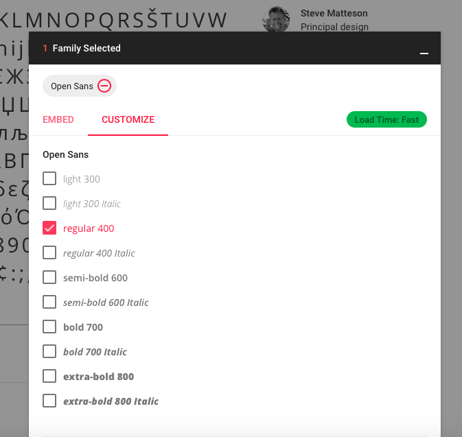
It will also show you the impact on the web page.
Now you can embed this custom link in your web page to use this font.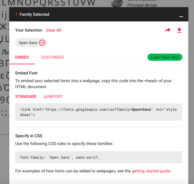
This is one of the best ways to use fonts on your web page.Now, let’s discuss another important thing – the Header. This is the first thing a viewer sees when he/she visits your web page. So, the header must be good looking and clean. Now is the age for minimalistic design. People and good web designer are going for clean, clear and sleek fonts. This can also be seen in many famous websites like Apple.com.

Here is an example where you can see the how the developer has made the use of sleek fonts. It is better to use font-weight 300 for headers.
These are some of the few tips and tricks that can be very helpful in better designing a web page. There are some more too, which I will add in another post. Thanks for now.