Want to build Custom Lookup in the Lightning? Don’t worry, it’s quick and easy!!
For this module, let’s divide it into three components:
- customLookup_Parent.cmp
- cutomLookupResult_Child1.cmp
- cutomLookupResult_Child2.cmp
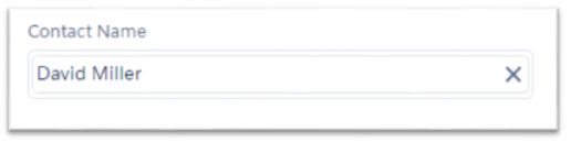
The parent component holds the search bar, modal popup or drop down list for showing results. (Refer Screenshot 1).
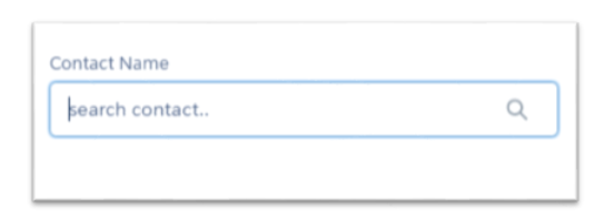
Screenshot 1. Parent component showing search bar
Child components will hold the search results based on the text entered in the search box of the parent.
cutomLookupResult_Child1.cmp(Screenshot 2) will handle results dynamically in a dropdown below the search bar while cutomLookupResult_Child2.cmp(Screenshot 3) will show the records in a table under the search bar in modal popup.
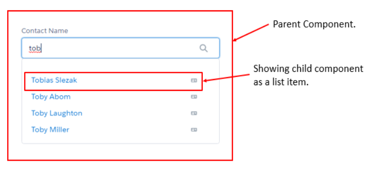
Screenshot 2. Result in cutomLookupResult_Child1.cmp
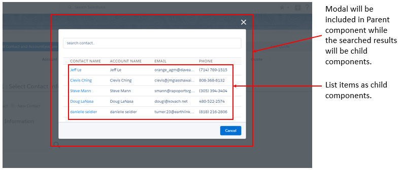
Screenshot 3. Result in cutomLookupResult_Child2.cmp on clicking search icon
Let’s follow the steps how to build it.
Parent Component(customLookup_Parent.cmp) :
Parent component contains a search bar, a dropdown and a modal popup. As soon as the user starts typing in search bar it will call the server side method and on response from server, a dropdown will appear under the search bar. This dropdown will have a list of child components resulted by cutomLookupResult_Child1.cmp.
There is another way to search the text as well: Click the search icon in the rightmost side of the search bar. On click of that the modal popup from the parent component will be visible. This popup will contain a search bar followed by a table. The table includes the results gathered on cutomLookupResult_Child2.cmp. If the user clicks the search icon without entering any text the records in the table will be by default set to “Recent 5 records”.
Note : Here, boolean variable is used to decide whether to open dropdown or Modal to show the result.
customLookup_Parent.cmp
[sourcecode language=”java”]</pre>
<aura:component controller=”lookUpController” implements=”force:appHostable, flexipage:availableForAllPageTypes, force:hasRecordId, forceCommunity:availableForAllPageTypes” access=”global”>
<!–Including lightning design system library–>
<ltng:require styles=”/resource/SLDS222/assets/styles/salesforce-lightning-design-system.css” />
<!–declare attributes–>
<aura:attribute name=”selectedRecord” type=”Contact” default=”{}” description=”Use,for store SELECTED sObject Record”/>
<aura:attribute name=”listOfSearchRecords” type=”Contact[]” description=”Use,for store the list of search records which returns from apex class”/>
<aura:attribute name=”SearchKeyWord” type=”string”/>
<aura:attribute name=”Message” type=”String” default=”Search Result..”/>
<aura:attribute name=”SearchedResult” type=”Contact[]”/>
<aura:attribute name=”Dropdownlist” type=”Boolean” default=”true”/>
<!–For applying CSS to/(Fixing the position of) Modal-Popup–>
<aura:attribute name=”cssStyle” type=”String” />
<!–For Hiding and showing the Spinner
<aura:attribute name=”Showspinner” type=”Boolean” default=’true’/> –>
<!–declare events hendlers–>
<aura:handler name=”oSelectedContactEvent” event=”c:selectedContactEvent” action=”{!c.handleComponentEvent}”/>
<aura:handler name=”myEvent” event=”c:selectedContactEvent” action=”{!c.GetSelectedCont}” />
<aura:handler event=”aura:waiting” action=”{!c.showSpinner}”/>
<aura:handler event=”aura:doneWaiting” action=”{!c.hideSpinner}”/>
<style>
{!v.cssStyle}
</style>
<!– https://www.lightningdesignsystem.com/components/lookups/ –>
<div class=”slds-m-around–large “>
<div aura:id=”searchRes” class=”slds-form-element slds-lookup slds-is-close” data-select=”single”>
<label class=”slds-form-element__label” for=”lookup-348″> Contact Name </label>
<!–This part is for display search bar for lookup–>
<div class=”slds-form-element__control”>
<div class=”slds-input-has-icon slds-input-has-icon–right”>
<div onclick=”{!c.SearchContact}”>
<c:svg class=”slds-input__icon slds-icon–large slds-show ” xlinkHref=”/resource/SLDS222/assets/icons/utility-sprite/svg/symbols.svg#search”/>
</div>
<!– This markup is for when an record is selected –>
<div aura:id=”lookup-pill” class=”slds-pill-container slds-hide”>
<span class=”slds-pill”>
<span class=”slds-pill__label”>
{!v.selectedRecord.Name}
</span>
<!–Button to remove the selection–>
<button class=”slds-button slds-button–icon slds-pill__remove” onclick=”{!c.clear}”>
<c:svg class=”slds-button__icon” xlinkHref=”/resource/SLDS222/assets/icons/utility-sprite/svg/symbols.svg#close”/>
<span class=”slds-assistive-text”>Remove</span>
</button>
</span>
</div >
<div aura:id = “lookupField” class = “slds-grid”>
<div style=”width:100%”>
<ui:inputText updateOn=”keyup” keyup=”{!c.keyPressController}” class=”slds-lookup__search-input slds-input” value=”{!v.SearchKeyWord}” placeholder=”search contact..” >
</ui:inputText>
</div>
</div>
</div>
</div>
<!–This part is for Display typehead lookup result List–>
<div class=”slds-lookup__menu slds” aura:id =”lookupmenu”>
<div class=”slds-lookup__item–label slds-text-body–small”>{!v.Message}</div>
<center> <ui:spinner aura:id=”spinner”/> </center>
<ul class=”slds-lookup__list” role=”listbox”>
<aura:iteration items=”{!v.listOfSearchRecords}” var=”singleRec”>
<!–Child Component for showing the searched result–>
<c:customLookupResult_Child1 oContact=”{!singleRec}” />
</aura:iteration></ul>
</div>
</div>
</div>
<!– Moadal Popup for showing the search window on press of lookup icon –>
<div role=”dialog” tabindex=”-1″ aura:id=”ContactLookup” class=”slds-modal slds-fade-in-open visibilityNO”>
<div class=”slds-modal__container”>
<div class=”slds-modal__header” style=”padding-bottom:15px;”>
<button class=”slds-button slds-modal__close slds-button–icon-inverse” title=”Close” onclick=”{!c.HideContactPopup}”>
<c:svg ariaHidden=”true” class=”slds-button__icon slds-button__icon–large” xlinkHref=”/resource/SLDS222/assets/icons/utility-sprite/svg/symbols.svg#close”></c:svg>
<span class=”slds-assistive-text”>Close</span>
</button>
<ui:inputText updateOn=”keyup” change=”{!c.keyPressController}” class=”slds-lookup__search-input slds-input” value=”{!v.SearchKeyWord}” placeholder=”search contact..” />
</div>
<div class=”slds-modal__content slds-p-around–medium”>
<div class=”slds-lookup__item–label slds-text-body–small”>{!v.Message}</div>
<table class=”slds-table slds-table–bordered slds-table–cell-buffer slds-table_fixed-layout”>
<thead>
<tr class=”slds-text-heading–label”>
<th scope=”col”><span class=”slds-truncate”>Contact Name</span></th>
<th scope=”col”><span class=”slds-truncate”>Account Name</span></th>
<th scope=”col”><span class=”slds-truncate”>Email</span></th>
<th scope=”col”><span class=”slds-truncate”>Phone</span></th>
</tr>
</thead>
<tbody>
<!–Child component for showing the searched result –>
<aura:iteration items=”{!v.SearchedResult}” var=”obj”>
<c:customLookupResult_Child2 con=”{!obj}” />
</aura:iteration></tbody>
</table>
</div>
<div class=”slds-modal__footer”>
<ui:button label=”Cancel” class=”slds-button slds-button–brand” labelClass=”label” press=”{!c.HideContactPopup}” />
</div>
</div>
</div>
<div class=”slds-backdrop slds-backdrop–open visibilityNO” aura:id=”popUpBackgroundId1″></div>
</aura:component>
<pre>[/sourcecode]
customLookup_ParentController.js
// function called on keyup in the search bar
keyPressController : function(component, event, helper) {
// get the search Input keyword
var getInputkeyWord = component.get(“v.SearchKeyWord”);
// check if getInputKeyWord size id more then 0 then open the lookup result List and
// else close the lookup result List part.
if( getInputkeyWord.length &amp;amp;amp;gt; 0 ){
var forOpen = component.find(“searchRes”);
$A.util.addClass(forOpen, ‘slds-is-open’);
$A.util.removeClass(forOpen, ‘slds-is-close’);
// Calling Helper function
helper.searchHelper(component,event,getInputkeyWord);
}
else{
component.set(“v.listOfSearchRecords”, null );
var forclose = component.find(“searchRes”);
$A.util.addClass(forclose, ‘slds-is-close’);
$A.util.removeClass(forclose, ‘slds-is-open’);
}
},
// function for clear the Record Selection
clear :function(component,event,heplper){
var pillTarget = component.find(“lookup-pill”);
$A.util.addClass(pillTarget, ‘slds-hide’);
$A.util.removeClass(pillTarget, ‘slds-show’);
var lookUpTarget = component.find(“lookupField”);
$A.util.addClass(lookUpTarget, ‘slds-show’);
$A.util.removeClass(lookUpTarget, ‘slds-hide’);
component.set(“v.SearchKeyWord”,null);
component.set(“v.listOfSearchRecords”, null );
var lookUpTarget =component.find(“lookupField”);
$A.util.addClass(lookUpTarget, ‘slds-show’);
$A.util.removeClass(lookUpTarget, ‘slds-hide’);
component.set(“v.Dropdownlist” , true);
},
// This function call when the end User Select any record from the result list.
handleComponentEvent : function(component, event, helper) {
// get the selected Contact record from the COMPONETN event
var selectedContactGetFromEvent = event.getParam(“contactByEvent”);
component.set(“v.selectedRecord” , selectedContactGetFromEvent);
console.log(component.get(“v.selectedRecord”));
var forclose = component.find(“lookup-pill”);
$A.util.addClass(forclose, ‘slds-show’);
$A.util.removeClass(forclose, ‘slds-hide’);
var forclose = component.find(“searchRes”);
$A.util.addClass(forclose, ‘slds-is-close’);
$A.util.removeClass(forclose, ‘slds-is-open’);
var lookUpTarget =component.find(“lookupField”) ;
$A.util.addClass(lookUpTarget, ‘slds-hide’);
$A.util.removeClass(lookUpTarget, ‘slds-show’);
},
// automatically call when the component is done waiting for a response to a server request.
hideSpinner : function (component, event, helper) {
var spinner = component.find(‘spinner’);
var evt = spinner.get(“e.toggle”);
evt.setParams({ isVisible : false });
evt.fire();
},
// automatically call when the component is waiting for a response to a server request.
showSpinner : function (component, event, helper) {
var spinner = component.find(‘spinner’);
var evt = spinner.get(“e.toggle”);
evt.setParams({ isVisible : true });
evt.fire();
},
// On Press of icon Modal-Popup will open
SearchContact : function (component, event, helper) {
component.set(“v.Dropdownlist” , false);
$A.util.removeClass(component.find(“ContactLookup”), “visibilityNO”);
$A.util.removeClass(component.find(“popUpBackgroundId1”), “visibilityNO”);
component.set(“v.cssStyle”, “.forceStyle .viewport .oneHeader {z-index:0; }.slds-global-header_container {position: static;} .forceStyle.desktop .viewport{overflow:hidden}”);
component.set(“v.Showspinner” , true);
var action = component.get(“c.getContacts1”);
action.setCallback(this, function(data) {
component.set(“v.Showspinner” , false);
component.set(“v.SearchedResult”, data.getReturnValue());
console.log(‘contactfirstname’ + JSON.stringify(component.get(“v.SearchedResult”)));
});
$A.enqueueAction(action);
},
// For hiding the Modal-Popup.
HideContactPopup : function (component, event, helper) {
component.set(“v.cssStyle”, “”);
$A.util.addClass(component.find(“ContactLookup”), “visibilityNO”);
$A.util.addClass(component.find(“popUpBackgroundId1”), “visibilityNO”);
// Setting boolean as true for dropdown list
component.set(“v.Dropdownlist” , true);
},
// Place the selected contact to output box
GetSelectedCont : function (component, event, helper) {
component.set(“v.cssStyle”, “”);
//Handle event from child component of who will send the particular selected contact
var cont = event.getParam(“contactByEvent”);
component.set(“v.selectedRecord”, cont);
var cc = component.get(“v.selectedRecord”)
// Hiding the dropdown list component when selecting the record from lookup window
var forclose = component.find(“lookup-pill”);
$A.util.addClass(forclose, ‘slds-show’);
$A.util.removeClass(forclose, ‘slds-hide’);
// Setting attribute used in search bar as null
component.set(“v.SearchKeyWord” , ”);
// Hiding the search bar on selection of one value
var lookUpTarget =component.find(“lookupField”) ;
$A.util.addClass(component.find(“lookupField”), ‘slds-hide’);
$A.util.addClass(component.find(“ContactLookup”), “visibilityNO”);
$A.util.addClass(component.find(“popUpBackgroundId1”), “visibilityNO”);
$A.util.removeClass(component.find(“searchRes”), “slds-is-open”);
$A.util.addClass(component.find(“searchRes”), “slds-is-close”);
var lookUpTarget =component.find(“lookupField”) ;
$A.util.addClass(lookUpTarget, ‘slds-hide’);
$A.util.removeClass(lookUpTarget, ‘slds-show’);
}
})
[/sourcecode]
customLookup_ParentHelper.js
[sourcecode language=”java”]</pre>
({
searchHelper : function(component,event,getInputkeyWord) {
// call the apex class method
component.set(“v.Showspinner”, true);
var action = component.get(“c.fetchContact”);
// set param to method
action.setParams({
‘searchKeyWord’: getInputkeyWord
});
// set a callBack
action.setCallback(this, function(response) {
component.set(“v.Showspinner”, false);
var state = response.getState();
if (state === “SUCCESS”) {
var storeResponse = response.getReturnValue();
// if storeResponse size is equal 0 ,display No Result Found… message on screen.
if (storeResponse.length == 0) {
component.set(“v.Message”, ‘No Result Found…’);
} else {
component.set(“v.Message”, ”);
}
// Set the boolean for hiding and showing the dropdown list and popup window
var Ddlist = component.get(“v.Dropdownlist”);
// set searchResult list with return value from server
if(Ddlist == false){
// set searched result to show in the table
component.set(“v.SearchedResult”, storeResponse);
}
else{
component.set(“v.listOfSearchRecords”, storeResponse);
}
}
});
// enqueue the Action
$A.enqueueAction(action);
}
})
<pre>[/sourcecode]
customLookup_Parent.css
[sourcecode language=”java”]
.THIS.visibilityNO {
display:none;
}
.THIS.visibilityNONE {
display:none;
}
.THIS .slds-modal{
background-color: rgba(0, 0, 0, 0.4);
}
.THIS .slds-modal__header{
padding-top: 30px;
padding-bottom: 0px;
border-bottom: none;
}
[/sourcecode]
Child Component (cutomLookupResult_Child1.cmp):
When the user starts typing in the search bar,it will call the server side method and on response of server cutomLookupResult_Child1.cmp component will be visible to show the related search results in a dropdown below the search bar (Screenshot 2) . Once the user selects the record, the drop down list will be hidden and selected record will be placed into pill container (Screenshot 4).
cutomLookupResult_Child1.cmp
[sourcecode language=”java”]
<aura:component >
<aura:attribute name=”oContact” type=”Contact” />
<!–Register the component level event–>
<aura:registerEvent name=”oSelectedContactEvent” type=”c:selectedContactEvent”/>
<!–Create a searched result dropdown list–>
<li role=”presentation”>
<span class=”slds-lookup__item-action slds-media slds-media–center” id=”lookup-option-350″ role=”option”>
<div class=”slds-media__body”>
<div class=”slds-input-has-icon slds-input-has-icon–right”>
<c:svg ariaHidden=”true” class=”slds-input__icon” xlinkHref=”/resource/SLDS222/assets/icons/standard-sprite/svg/symbols.svg#contact”/>
<div class=”slds-lookup__result-text”><a onclick=”{!c.selectContact}”>{!v.oContact.Name}</a></div>
</div>
</div>
</span>
</li>
</aura:component>
[/sourcecode]
cutomLookupResult_ChildController.js
[sourcecode language=”java”]
({
selectContact : function(component, event, helper){
// get the selected Contact from list
var getSelectContact = component.get(“v.oContact”);
// call the event
var compEvent = component.getEvent(“oSelectedContactEvent”);
console.log(“getSelecteContact”+ JSON.stringify(getSelectContact));
// set the Selected contact to the event attribute.
compEvent.setParams({“contactByEvent” : getSelectContact });
// fire the event
compEvent.fire();
},
})
[/sourcecode]
Child component (cutomLookupResult_Child2.cmp) :
When the user click on the search icon in the search bar (shown in screenshot 1), modal popup will be visible from the parent component independent whether the search bar has any text entered or not. This functionality will be provided by Parent component. The Modal popup will have cutomLookupResult_Child2.cmp in it. Child component shows the recent 5 records accessed if the search text is not entered. If the text is entered in the search bar before clicking the search icon, this component will show the same data in a table form compared to child component.cmp in a drop down. Once the user will select the record, the modal popup be hidden and selected record will be placed into pill container similar to cutomLookupResult_Child1.cmp .(Screenshot 4).
cutomLookupResult_Child2.cmp
<aura:component implements=”force:appHostable, flexipage:availableForAllPageTypes, force:hasRecordId, forceCommunity:availableForAllPageTypes” access=”global”><aura:attribute name=”con” type=”Contact[]” />
<!–Registration of event to pass the selected result back to Parent component–>
<aura:registerEvent name=”myEvent” type=”c:selectedContactEvent” />
<!– Table showing searched result–>
<tr class=”slds-truncate”>
<td class=”slds-truncate” title=”{!v.con.LastName }”>
<a onclick=”{!c.selectContact}”>{!v.con.Name } {!v.con.LastName }</a></td>
<td class=”slds-truncate” title=”{!v.con.Account.Name}”>{!v.con.Account.Name}</td>
<td class=”slds-truncate” title=”{!v.con.Email}”>{!v.con.Email}</td>
<td class=”slds-truncate” title=”{!v.con.Phone}”>{!v.con.Phone}</td>
</tr>
</aura:component>
<pre>[/sourcecode]
cutomLookupResult_Child2Controller.js
[sourcecode language=”java”]
({
selectContact: function(component, event, helper) {
// call the event
var cmpEvent = component.getEvent(“myEvent”);
console.log(“getSelecteContact”+ JSON.stringify(component.get(“v.con”)));
// Pass the selected result(i.e Contact) value
cmpEvent.setParams({
“contactByEvent”: component.get(“v.con”)
});
// Fire an Event
cmpEvent.fire();
}
})
[/sourcecode]
Event(c: selectedContactEvent) :
Once user will select the particular record from any of the child components, the component event(c: selectedContactEvent) will be fired from child component and event handler on parent component will set that record into the pill container as shown below in the screenshot.
If you want to remove the selection, you can press on cross icon shown on the right hand side of pill that will hide the pill container and show the searchbar. Which will allow you to search again.
Screenshot 4. Selected record in pill container
c: selectedContactEvent
[sourcecode language=”java”]
<aura:event type=”COMPONENT” description=”by this event we are pass the selected contact in the parent component”>
<aura:attribute name=”contactByEvent” type=”contact”/>
</aura:event>
[/sourcecode]
As it is component event we can use it for multiple components, so here we are firing the two events of the same type with different event names having same event type which will be handled by two different handler in the parent component .
Apex Controller(lookUpController.cls) :
This apex controller is used to retreive the records from server side.
lookUpController.cls
[sourcecode language=”java”]
public class lookUpController {
// calling on search of contacts
@AuraEnabled
public static List < Contact > fetchContact(String searchKeyWord) {
String searchKey = searchKeyWord + ‘%’;
List <Contact > returnList = new List < Contact > ();
List < Contact > lstOfContact = [SELECT Id, Name, MailingStreet, MailingCountryCode, MailingCity, MailingStateCode,
MailingPostalCode, AccountId, Account.Name, Phone, Email FROM Contact where Name LIKE: searchKey];
for (Contact con: lstOfContact) {
returnList.add(con);
}
return returnList;
}
// initial list of recent items
@AuraEnabled
public static List < Contact > getContacts1() {
List < Contact > lstOfContact1 = [SELECT Id, Name, MailingStreet, MailingCountryCode, MailingCity, MailingStateCode,
MailingPostalCode, AccountId, Account.Name, Phone, Email FROM Contact WHERE LastModifiedDate != NULL ORDER BY LastModifiedDate DESC LIMIT 5];
system.debug(‘contacts’+lstOfContact1 );
return lstOfContact1;
}
}
[/sourcecode]
This custom lookup is mainly useful for custom pages as we need to specify the object and query that specific object.
In the upcoming blog we will deal with custom lookup which would be dynamic for any object, where user can just drag and drop the component on a record detail page.


